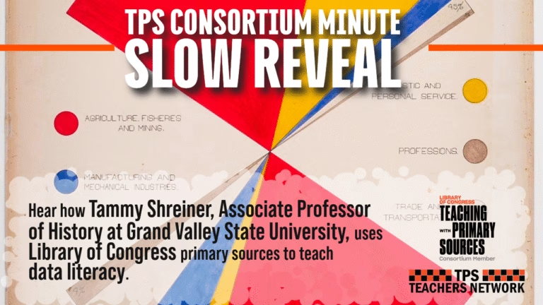
Learn how Tammy Shreiner, Associate Professor of History at Grand Valley State University, uses Library of Congress primary sources to teach data literacy.
Grand Valley State University received a grant from the Teaching with Primary Sources program at the Library of Congress. Their grant focused on using primary sources as artifacts to teach the Slow Reveal process for improving data literacy in middle and high school.
Read a more in-depth article on the slow reveal process here: Teaching with Primary Source Data Visualizations through Slow Reveal
Transcript:
Primary Source Selection:
W.E.B Du Bois is an important figure in the progressive era and in American history in general.
This was one of the data visualizations he included in the exhibit he prepared for the 1900 Paris Exposition to highlight African American progress in the United States. It’s a great example of the simple yet powerful graphics he included in the exhibit to illustrate the achievements of African Americans despite the barriers and discrimination they faced in the US.
I used this in an inquiry focused on Du Bois’ messaging at the Exposition, and asked students to study it using a technique called slow reveal.
In this technique you strip a data visualization down to its basic skeleton so it’s free of any title, labels, key or numbers. All that’s visible to students are the signifiers that represent the data, such as the shapes, lines, or bars. Then each visual element is revealed, one at a time, allowing students to ponder each new piece of information, and what it tells them.
Analysis:
This source is good for students to analyze for a couple of reasons. First, if you’re interested in teaching data literacy, it allows you to talk about why it’s not a pie chart, which is usually the first thing students guess. And to teach them about both proportions and making comparisons.
Second, it can raise interesting discussions with students about the historical context. The equivalencies between whites and blacks in the graphic were a very bold message for Du Bois to present at the time. Yet students might also ask questions about the different percentages in the professions and domestic work in the graphic.
In the Classroom:
As predicted, students tend to guess that it’s a pie chart, which has allowed me to ask them follow-up questions about what a pie chart is and why it isn’t a pie chart. And we’ve consistently had great discussions about the choices Du Bois made in designing that graphic as well as what the numbers tell us about conditions in the United States in the late 19th century and in the South in particular.